In this dynamically growing digital world, responsive web design becomes highly essential. Users visit your website from an array of devices and browsers, but the problem arises if your website fails to respond to any of them. That problem can be handled with the help of the Responsive Web Design Technique.
What is Responsive Web Design?
Responsive Web Design makes sure that your website works for all devices and browsers of different sizes and resolutions. It also assures that your website is smart enough to resize and adapt itself according to the type of device it is rendered to.
In the age of increasing smartphone usage, web design companies design and develop websites in a way that they are optimized to be used on iPad, iPhone, Android and other platforms. Professional web designers and various platforms such as Wordpess- a web design company, use Responsive Web Design to provide a better user experience.
How does it work
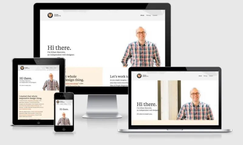
Let’s have a look at Web Design Application created by Ethan Marcotte – who is also the first person who defined Responsive Web Design.
As you can see in the above image, every single piece of content on the website renders perfectly, irrespective of the device’s screen resolution or size.
Professional web designers should know how to leverage fluid, proportion-based grids, flexible images and media, and CSS Media Queries to create a responsive website.
Flexible Layout/Fluid Grid uses proportional sizes to fit every page, Flexible Images and Media uses CSS to make sure that images or media do not overflow out of their containing elements, and Lastly, the most effective one – CSS3 Media Queries are used to detect browser resolution and act accordingly.
The Art of Media Queries in Responsive Web Design
Media Query is a CSS3 technique that allows a web page to use different CSS styles based on factors such as screen resolution, viewport, device size, and orientation. These factors are termed media rules.
Basically, a media query consists of a media type and can contain one or more expressions that resolve to either true or false.
- Media Type defines the type of media or device to which the particular CSS rule should be applied to. There are four options of media type – all, print, screen, and speech. Mainly the media-type “screen” is used which includes tablets, computer screens and smartphones.
- Expressions/ Media Feature helps to further target devices based on different device features such as width and height. The ones which are used more often for Responsive Web Design are max-width, min-width, max-height, and min-height.
- CSS Style Rules are the CSS rules listed inside the curly braces of the media queries.
Let’s consider media query examples for different viewports:
As you can see in the media queries above, all of them have media type as “screen” for various types of devices, media expressions as min-width and max-width, and curly braces which include CSS styles for a particular query.
There is another way of using media query using link tag as follows:
Though here it becomes a tedious task to write media queries for all devices you support for your web application. It’s preferable to use the inline style.
Conclusion
To sum up, responsive website design acts as a foundation for your presence on the web, handling a wide range of scenarios smoothly. It not only makes your website work well on different devices but also helps you stay ahead of the competition in the world of digitization. With increased mobile usage, the technique of Responsive Web Design is also improving every day.